Spotlight on Raoul Marks
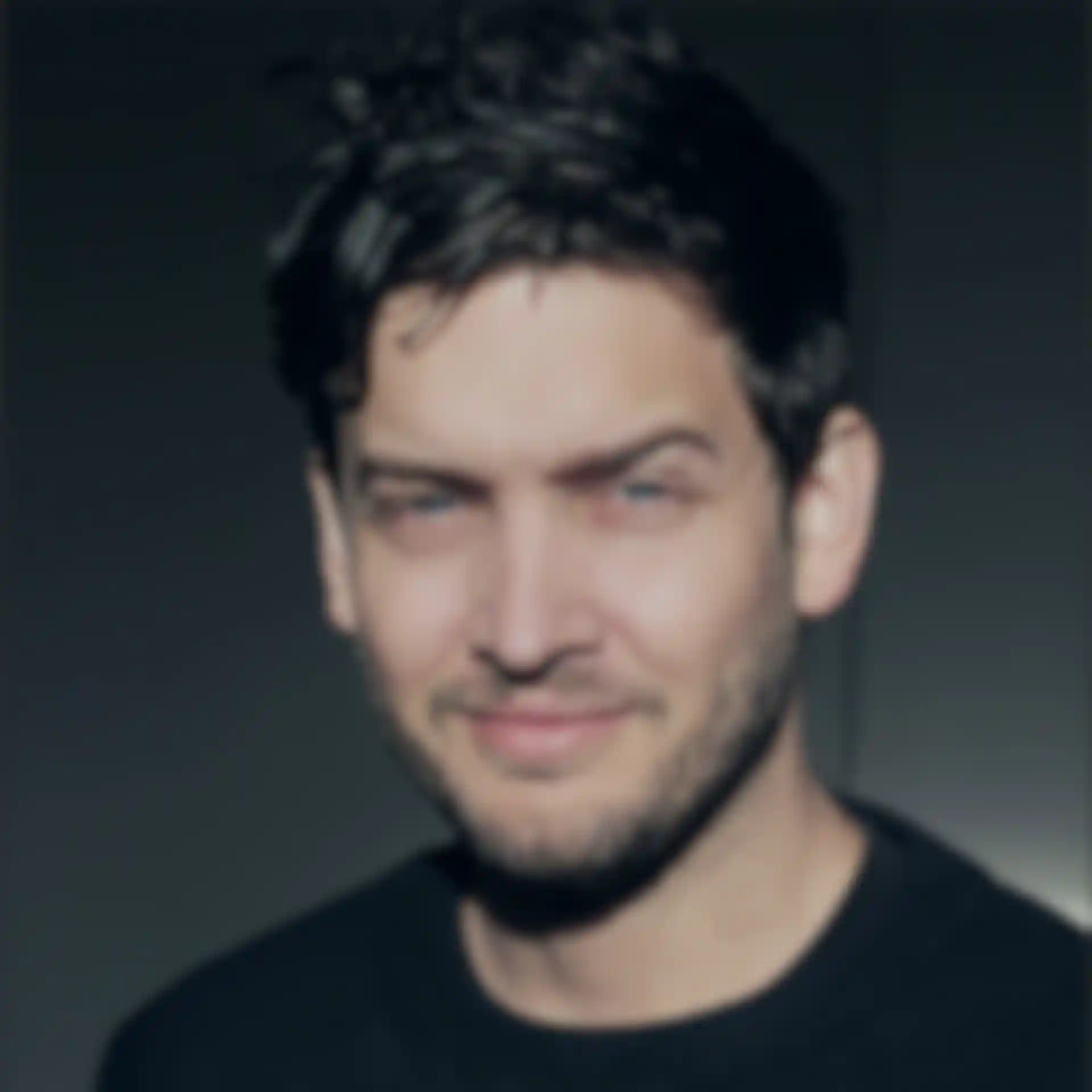
Raoul Marks is an award winning motion artist who lives in Melbourne, Australia and works with Elastic studio in Los Angeles. Raoul and his team, led by creative director Patrick Clair, are responsible for some of the most recognized television titles sequences, including Emmy Award winners ‘Man in the High Castle’ in 2016 and ‘True Detective’ 2014, and Emmy nominees ‘The Night Manager’ and ‘Halt and Catch Fire’. Raoul also designed and produced the opening titles for the 2015 Semi-Permanent design conferences, a nominee at the SXSW Film Festival.”
Editor Adriene Hurst of digital media world had the chance to ask Raoul about his career, his approach to titles design and his favourite sources of inspiration.
Please share some of your professional background and education as a graphic artist and animator.
I studied design at Curtin University back in the early 2000s and worked as a graphic designer. I spent some time in the UK working in film advertising and returned to Sydney/Melbourne and started focusing on motion graphics for television/film in about 2010.
Could you identify some of the major influences on your work today? These could be from your education but also include other artists, another art form like music or literature, a place, person, time in history and so on.
Film has been a great educator for me. I lean towards that and photography as a central source for inspiration. Classics like ‘Blade Runner’, ‘Alien’, ‘2001’, ‘Videodrome’ and ‘Akira’ [Katsuhiro Otomo] have all been very influential in informing my style. Those films are visually very striking but they also manage to get under your skin. They have a certain atmosphere or tone to them that is hard to pinpoint. They are escapist but also leave you with a slightly queasy or existential type feeling. Obviously I’m not making feature films but those tonal qualities are what get me excited about image making and I often go back to them to get the brain ticking over.
Recently I’ve been really getting into Jeffrey Smart’s paintings. He had an amazing sense for colour and geometry – a master at creating an unnerving image.
In terms of more contemporary inspirations, they come and go but currently what I’ve been finding exciting is ‘Under the Skin’ by Jonathan Glazer, anything by Adam Curtis, and I’m keen to sit down and watch the latest series of ‘Black Mirror’ [TV series].
What attracts you to working in motion graphics? As a way to express artistic ideas?
First, we are extremely lucky to get paid for what we do. It doesn’t feel like work -usually. I’ve always found great enjoyment in artistic output. Working with digital tools is particularly rewarding because it’s an extremely effective process. Ultimately, all creative endeavours are somewhat frustrating as you are trying to translate what’s in your mind's eye to the page or screen. The smoother and quicker that translation is, the more rewarding the emotional response for the artist. I think that is why I lean towards digital tools. I’m basically impatient and want to get the images out as quickly as possible.


... as a means of communication that you create professionally for clients to help them reach their target audiences?
I work with a team of people and very closely with a creative director. I find that process of trying to reach a common visual language while executing something very specific a complex but rewarding challenge. We are limited by the simplicity of language, which is our common denominator, so it’s great developing a shorthand over time with colleagues that helps us communicate more fluently.
Looking more broadly towards client and audience, it’s interesting to see how our work is interpreted. It’s not always as intended and sometimes that’s great. We had people a few episodes into ‘True Detective’ saying the titles had clues as to who the Yellow King was. At that point we hadn’t watched the full series so I had no idea what they were talking about.
In other words, I think you can over-manage and over-think a project from an audience perspective. If you can make something that feels new, that feels novel and excites you in a way that is hard to reduce to a logical statement, then you’re a good way to creating something that will make an impact in the wider world.
“I’ve been using Cinema 4D since I was at university. I found the more cumbersome, programmer-skewed methodologies of other 3D packages were a barrier to entry.”– Raoul Marks
Which software were you initially using when you learned to create and animate graphics?
I’ve been using Cinema 4D since I was at university. I found the more cumbersome, programmer-skewed methodologies of other 3D packages were a barrier to entry. At that point, Cinema was set up in a way that made it easy to jump in as a novice and get good results very quickly. That initial quick reward loop made it an addictive piece of software and kept me using it on-and-off over the last decade.
It has evolved over the years and has become very resilient and versatile for a whole array of creative applications. It also plugs in with a lot of other tools – thankfully CGI tools have become very agnostic, with imports and exports, so Cinema 4D is often working as the mothership for a whole family of tools for specific tasks.
Cinema 4D users are known for their willingness to share their knowledge, post tutorials and create opportunities to learn the software from each other. Could you describe your own experience of this community as you learned Cinema 4D?
I started out with Cinema 4D many years ago and there wasn’t nearly the same support network. We felt a bit like the new kids on the block. But slowly and surely over the years the user base has grown steadily to the point where it seems to be one of the biggest groups of artists. If you run into a snag there’s usually an answer a short ‘Google’ away. If you look at a site like lesterbanks.com, I often find the majority of material is related to Cinema 4D, not to mention the myriad of other almost exclusively Cinema 4D sites like GreyscaleGorilla, etc.
Are you typically using Cinema 4D on its own or alongside other graphics, 3D and rendering packages like Photoshop, After Effects, Arnold (there lots of others, of course)? Please share a few comments about integrating Cinema 4D into workflows or pipelines.
As I mentioned, Cinema 4D has become a central mothership of sorts. It’s at the center of a wide range of tools. Most important for me was the development of the Octane Render engine. It’s fundamentally changed the way I work. As a freelancer with my own gear I don’t have access to a large render farm. Octane basically replaces a render farm with the power found in modern graphics cards.
But more importantly than that, it allows me to light and texture in real-time. It takes another big chunk of time out of the creative feedback loop, which makes the number of iterations you go through almost infinitely larger. That’s a huge thing when it comes to creating complex realistic-looking visuals. The fewer the limitations the technology has, the closer we get to the artist’s Holy Grail – being able to perfectly translate what’s in your mind's eye to the page. In addition to that, tools like 3D Coat, Fusion 360 and Megascans offer a huge amount of power for creative output.
Which of the updates in R18 stand out for you and make a difference for your own work?
The core tools have been very solid for a while now, so some of the new updates often go past me. But generally it’s the little workflow and stability updates that really help me out. Support for Alembic was extremely useful. Updates to the Knife tool and the Polygon Pen were also great additions.
Many projects you have worked on are based on photography, or use photographic and photoreal elements - instead of more abstract or stylised animated graphics. Could you share some ways you look at and make the most of photography as a designer and animator? For example, bringing the images to life with motion & graphics without losing their original intention.
In essence I’m probably a frustrated film maker, so I think that’s what pushes me towards realism. That said, it’s not realism for realism sake that interests me. Real world photography is often a very carefully constructed process. They’re not angling for realism for its own sake - they want to make an image that arrests the eye. I have the same goal, but just use different tools.
What are some techniques you have for approaching new projects and looking for ways to visualise a story?
In terms of title design, primarily we are informed by the imagery, content and themes of the show. The pitch document goes a long way to interpreting that aesthetic and fusing it with our own influences and interpretation of the story.
Personally, I’m often drawn to either focusing on the macro or the micro. The show itself will obviously be exploring the meat of those narratives and extended themes and meaning. The titles shouldn’t be merely retelling those points, but circling around them, alluding to something more symbolic about the overall narrative message, or focusing in on a minute detail that reflects a wider simplicity about the story.
For example the titles we did for ‘Halt and Catch Fire’, was an impossible close-up sequence of the electrical signal running along wires and mainboards to illuminate the little flicking light at the front of a 1980s-era PC. In itself, it’s a regular, mundane piece of operating procedure for a computer from that time, but we used it allegorically to illustrate the competing forces driving young tech entrepreneurs towards a new technological dawn. The birth of a new idea, and the great pressure these characters were put under, transferred neatly into a metaphorical world of electrons and circuitry.
That double meaning is often a good area to explore, as it’s conceptually interesting for the viewer as well as allowing you to make broad symbolic comments about the show’s themes without having to explicitly depict it. A great example of this is the title sequence for ‘Dexter’. It simply shows a man making his breakfast, but filmed in such a way as to allude to the more sinister intentions of the protagonist’s double life.
When you are looking for reference, especially at the start of a project, what are some favourite sources?
I usually start research for sources outside our industry. Photography and film, as I’ve mentioned, are great starting points. But fields like contemporary art, sculpture, painting and more experimental forms can also be very productive.
A lot of artwork may be rather impenetrable to a general audience, but when reinterpreted and placed in a different context, it can be very effective in creating striking imagery. I guess you could call it cross-pollination. I think we benefit from bringing in inspiration from as wide a field as possible.
Winning awards is inspiring! When you see your team’s work recognised with an award or nomination, how do you take advantage of that success as you go forward into your next projects?
I’m really lucky to work with some very talented people. Patrick Clair, my Director at Elastic, has been consistently coming up with brilliant ideas, so a large part of my success goes in thanks to his genius efforts.
What I hope comes from things like the Emmy wins is the freedom and support to explore more risky and innovative ideas in our work. I’ve already found it surprising how open-minded and progressive the clients we work with are about the concepts we put to them. If I can continue to work in titles design for the near future I’ll be very content. It’s a privilege.
About the recent 2016 Emmy Award for the ‘Man in the High Castle’ titles, could you identify some aspects of it that you believe contributed to that win?
It’s hard to tell what’s going to hit with the voting audience, but I think there’s something seriously brilliant about Philip K. Dick’s original novel that shines through in the TV adaptation. An alternate universe, in which the Axis won the Second World War, created for us a plethora of symbolic imagery to work with. Shots of the Nazi eagle emblazoned over the American bald eagle create a whole list of connotations. I think that subversion of American icons lead to the titles having an iconic quality and thus being awarded the gong.
Credits:
HBO Westworld - Main Titles
Client: HBO
Director: Patrick Clair
Lead Animator / Compositor: Raoul Marks
Design & Visual Research: Paul Kim, Jeff Han, Felix Soletic, Maxx Burman, Henry DeLeon, Dan Alexandru.
Storyboard Artist: Lance Slaton
Lighter: Shamus Johnson
Animator / Compositor: Yongsub Song
Head of CG: Kirk Shintari
3D Artists: Jose Limon Jessica Hurst, Dustin Mellum, Rie Ito, Joe Paniagua, Mike Kash, Ken Bishop
3D Rigging: Josh Dyer
Reference Photography: David Do
Producer: Ben Foster
Supervising Producer: Carol Salek
Head of Production: Kim Christensen
Managing Partner: Jennifer Sofio Hall
Special Thanks to Jonathan Nolan, Lisa Joy, Bruce Dunn, Mark Hoerr, Stephen Semel, Athena Wickham, Roberto Patino and HBO.
The Crown - Main Title Sequence
Produced by: Elastic
Creative Director: Patrick Clair
Lead Animation and Compositing: Raoul Marks
3D Look Development: Javier León Carrillo
Designers: Paul Kim, Jeff Han, Felix Soletic, Maxx Burman
Head of 3D: Kirk Shintani
3D Artists: Joe Paniagua, Ian Ruhfass
2D Animator: Tony Kandalaft
Associate Producer: Danny Hirsch
Head of Production: Kim Christensen
Managing Director: Jennifer Sofio Hall
“The Night Manager” Title Sequence
Elastic
Director | Patrick Clair
Client | The Ink Factory
Network | BBC One
Designers: Paul Kim, Jeff Han, Kevin Heo, Felix Soletic, Nick Miller
Lead Animator: Raoul Marks
Animators: Youngsub Song, Lucy Kim
Special Thanks: Angus Wall
Producer: Zach Wakefield
Pitch Producer: Carol Collins
Coordinator: Danny Hirsch
Head of Production: Kim Christensen
Executive Producer: Jennifer Sofio Hall