
Maxon Unveils a Brand New Look for its Growing Family of Professional Tools Maxon introduces a unified product logo system to strengthen ecosystem identity and reflect brand evolution.
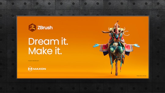
Bad Homburg, Germany – September 10, 2025 – Maxon, maker of powerful, approachable software solutions for creators working in 2D and 3D design, motion graphics, visual effects, and more, today announced a fresh unified product logo system designed to visually connect its suite of creative tools – Maxon One, Cinema 4D, Red Giant, ZBrush, Redshift, Universe, Capsules, Cinebench, Cineware, and Moves – within a cohesive ecosystem. This redesign introduces a modular, consistent, and connected visual identity, underscoring Maxon’s commitment to fostering clarity, creativity, and connection for its growing family of tools.
Evolving the Maxon Design Language
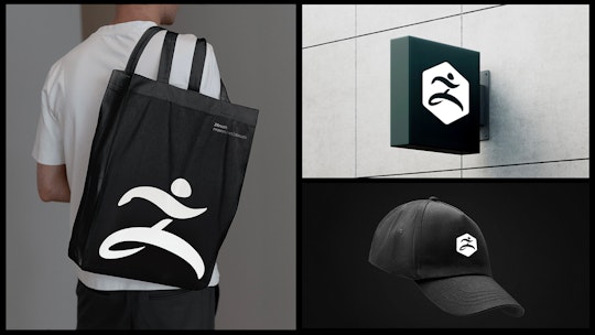
Maxon’s new product identities were designed to fit seamlessly with the existing Maxon logo mark, mimicking the look and feel of a honeycomb and mirroring the philosophy behind Maxon One: individual tools, distinct in purpose, but unified in workflow and stronger together. Each logo adopts a simplified geometric design and vibrant accent color, ensuring instant recognition while fitting seamlessly into the broader brand architecture.
These new product logos extend the brand identity into every corner of Maxon One, providing a clear, connected look that captures the unique spirit of each tool in the Maxon lineup while maintaining the coherence of a single family of professional products.
“Redesigning a logo system is more than aesthetics; it’s an opportunity to celebrate and empower the community we serve,” said David McGavran, CEO of Maxon. “Maxon’s mission is to remove friction and give artists freedom to create without limits, and this refreshed design reflects that mission in its unified ecosystem of tools designed for intuitive workflows, technical precision, and boundless creativity. It showcases our legacy, highlights our advancements, and sets the stage for an exciting future built around the needs of our users.”
The modular framework ensures logos retain clarity even at smaller sizes and across digital platforms. A reimagined typography structure introduces hierarchy and balance across the system. “Our goal was to create a visual identity that feels inherently Maxon while highlighting the distinctive attributes of each tool,” said Leo Hageman, Director of Brand and Creative, who oversaw the transformation of the Maxon One logo system.


New Look, New Innovations at IBC2025
Maxon will be showcasing its fresh look and latest software innovations at IBC2025 in Amsterdam, September 12-15, Booth 7.B45. Live demonstrations, presentations by industry-leading artists, and community events will showcase how Maxon’s unified tools and brand identity help creators dream bigger and make it real.
The logo redesign is part of Maxon’s Fall 2025 ecosystem release, which introduces cutting-edge advancements across motion graphics, sculpting, rendering, and visual effects, all wrapped in a refreshed brand identity that is consistent, approachable, and forward-looking.
Empowering Every Creative Journey
From the classroom to a blockbuster film set, the TikTok timeline to the architectural design plans, Maxon’s tools are trusted by artists and studios that are powering content in every shape and form. By connecting the look and feel of its tools, Maxon signals its continued focus on innovation, integration, and community as the driving forces of its identity.
Maxon plans to roll out the visual updates comprehensively across its website, social channels, and software platforms beginning in September 2025. To support its community, Maxon will also release a dedicated brand guidelines mini-site, offering partners and resellers easy access to assets and guidance for maintaining consistency.