Behind the Screens of Feature Films UI design futurist Jayse Hansen on his career designing holograms and advanced future tech for Iron Man, Robocop, Katniss, Spiderman and many other superheroes and characters.
Jayse Hansen remembers exactly where he was when he realized what he wanted to focus on as an artist. It was 2005 and he was at a design conference listening to fictional user interface (FUI) pioneer Mark Coleran describe how he created FUI for films like Mission Impossible, Alien vs. Predator and The Bourne Identity. Watching intently as Coleran presented his screen designs for mini spy cameras, holo tables and FBI forensic labs, he thought: "That has to be the best job ever." Though he knew nothing about how to get started, he knew he wanted in.
Back home, he couldn’t stop thinking about how FUI combined his favorite parts of feature films—high-tech design, advanced visual effects, slick animation and 3D compositing. So he embarked on a path to learn everything he could, which wasn't easy since there's never been much online about it. But he kept honing his skills, hoping that one day he might get to design "some small widget that would be on screen in the background of a movie."
Hansen never dreamed that just a few years later he’d be the world's most well known FUI designer. Relying primarily on Cinema 4D, Red Giant tools, After Effects and Illustrator he has worked on everything from holograms and heads-up-displays to advanced medical simulations for blockbuster film franchises, including Star Wars, The Hunger Games, Iron Man, Top Gun, Batman, Planet of the Apes, Spider-Man, X-Men, Guardians of the Galaxy and many more.
Today, he has effectively become the go-to designer for numerous beloved fictional characters, from Tony Stark and Nick Fury to Star-Lord and Spiderman. He was even chosen as the designer of R2D2’s return to the big screen, featuring what is perhaps the most iconic hologram of all—R2D2’s holographic map to Luke Skywalker in Star Wars: The Force Awakens.


We asked Hansen to talk about some of the projects he’s worked on and how he approaches FUI design creatively, as well as how he structures his workflow. Here’s what he had to say.
What drew you to this kind of design work in particular?
My mom actually thought I should become an engineer or architect because I’ve always loved detailed schematic drawings, blueprints and medical diagrams. But I just didn’t have the patience for all the rules, regulations and standards you had to learn. Eventually, I figured out that I just wanted to create things that looked cool, advanced and beautiful. I wanted to do the imaginative part without being limited by all the rules. Luckily, FUI design was the perfect solution.
What software do you use?
I mainly use Cinema 4D, Illustrator and After Effects. Then, I’ll add Red Giant tools to supercharge my workflow. Sometimes, when I need something special for a film I’m working on, I’ll just ask Red Giant's Harry Frank or Aharon Rabinowitz, and they’ll say, ‘Yeah, we can do that.’


Tell us about some of the custom tools Red Giant has made for you?
For Top Gun: Maverick, I told Harry Frank that we needed to generate a lot of screens with very particular text in very orderly columns that I could art direct and animate quickly. He created a plugin that allowed me to do that without a lot of manual work. That plugin, which is called Text Tile is now part of the Red Giant Universe. And there are a few more, like selective color Glow.
For holograms, specifically, I needed a less tedious way to show a holographic projection beam from a light source. All my previous ways took a long time to set up and manage. Harry came up with the Point Zoom plugin, which is super useful for these types of effects.
Describe your workflow. Do you start with the script?
Yes, I usually start by reading the entire script to get a sense of the story. I make notes on relevant story points, as well as the specific technical language and terminology the actors use within the story. I also study the production designer’s vision for the film because I want to design something unique that fits the tone, mood and aesthetic.
I read that you work with experts to make your designs more plausible.
Yeah, it’s a must. Audiences can tell in half a second if something is just random and careless. We’re also telling such far-fetched stories sometimes that, for balance, we like to keep the designs grounded and realistic, while still being inspirational, imaginative and outside the box. I do some fairly intense research with real-world subject matter experts (SME’s). I consulted with an A-10 fighter pilot for Iron Man's HUD.
For Top Gun, production assigned me to a daily SME from deep within Lockheed Martin’s Skunk Works division. I also consulted an F-18 fighter pilot extensively for other cockpit and tactical screen designs. Everyone from Tom Cruise to Joseph Kosinski [director] to Lockheed was excited to have the designs be as accurate and real-world as possible. They know that a large part of Top Gun fans are actual pilots who would appreciate a cinematic yet-researched approach to the graphics and tactical screens. I still can’t say much more about the film since the release date has just been pushed. But it will definitely be worth seeing on the big screen.
Does your deep level of work sometimes gets lost in the fast-paced world of film?
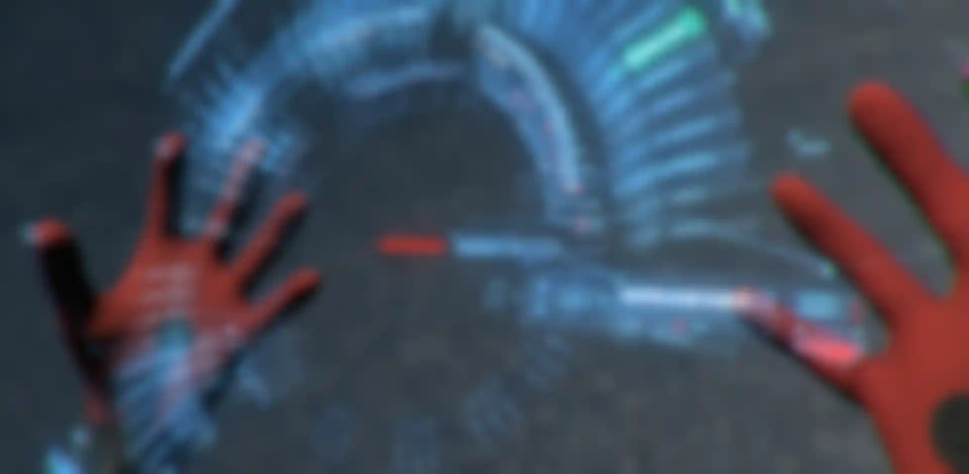
Yes, most of the time. But with Spiderman: Homecoming they actually wrote in a few comedic scenes about the extreme detail I put into Tony Stark's UIs, which was fun. During the brief they told me that they wrote a few funny scenes about how overly complicated a Tony Stark-designed HUD would be to a naive teenager.
So when Peter Parker (Tom Holland) first puts on his upgraded Spiderman mask, they wanted the new Spidey HUD to showcase every function, feature, gadget and widget possible; all animating on in quick succession in order to completely overwhelm him. Later, he has to choose from a holographic menu of 576 web types and mistakenly activates Instant Kill Mode. Stuff like that was super fun to design.
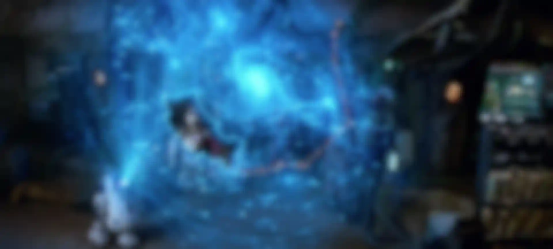
That actually was the ultimate project for me. I was doing the suit blueprint screens too, so I got to be a total Spiderman geek on that film. I gathered all that I had done previously on Iron Man HUDs and augmented that with new knowledge from my real-world consultant design work. I referenced parkour experts (which uses movement used in military obstacle course training) and cave diving spelunkers, and I read every comic and book I could find about the Spiderman suit itself to flesh it out.
I even joined online groups of people attempting to create ‘real’ web fluid. Some have had amazing success. What were they concerned with? The mix ratios of different chemicals they were using to make it work in the real world. All of that knowledge went into the HUDs, holograms and suit-blueprint screens I designed.
When you start a project, do you go straight to digital?
I’ve tried to go straight to digital, but paper makes me think differently. So, initially I’ll do a lot of rough pen and paper sketches, or sketches on the iPad before moving on to Illustrator. After that, I’ll go After Effects and Cinema 4D for animation and compositing.
I did something new for Spidey’s holographic UIs, though. I used Gravity Sketch and Tilt Brush to sketch my holographic UIs in full 3D, and in VR with my Oculus. Being able to think and draw in 3D has been a game changer in my workflow.
How do you present your designs?
When I submit a design concept, I strive to present it as it might look in camera. So I usually run it through After Effects, using Magic Bullet Looks and other techniques to give it a more optical, shot-through-a-lens look. This tends to help the director envision how the designs will live within a more filmic world.
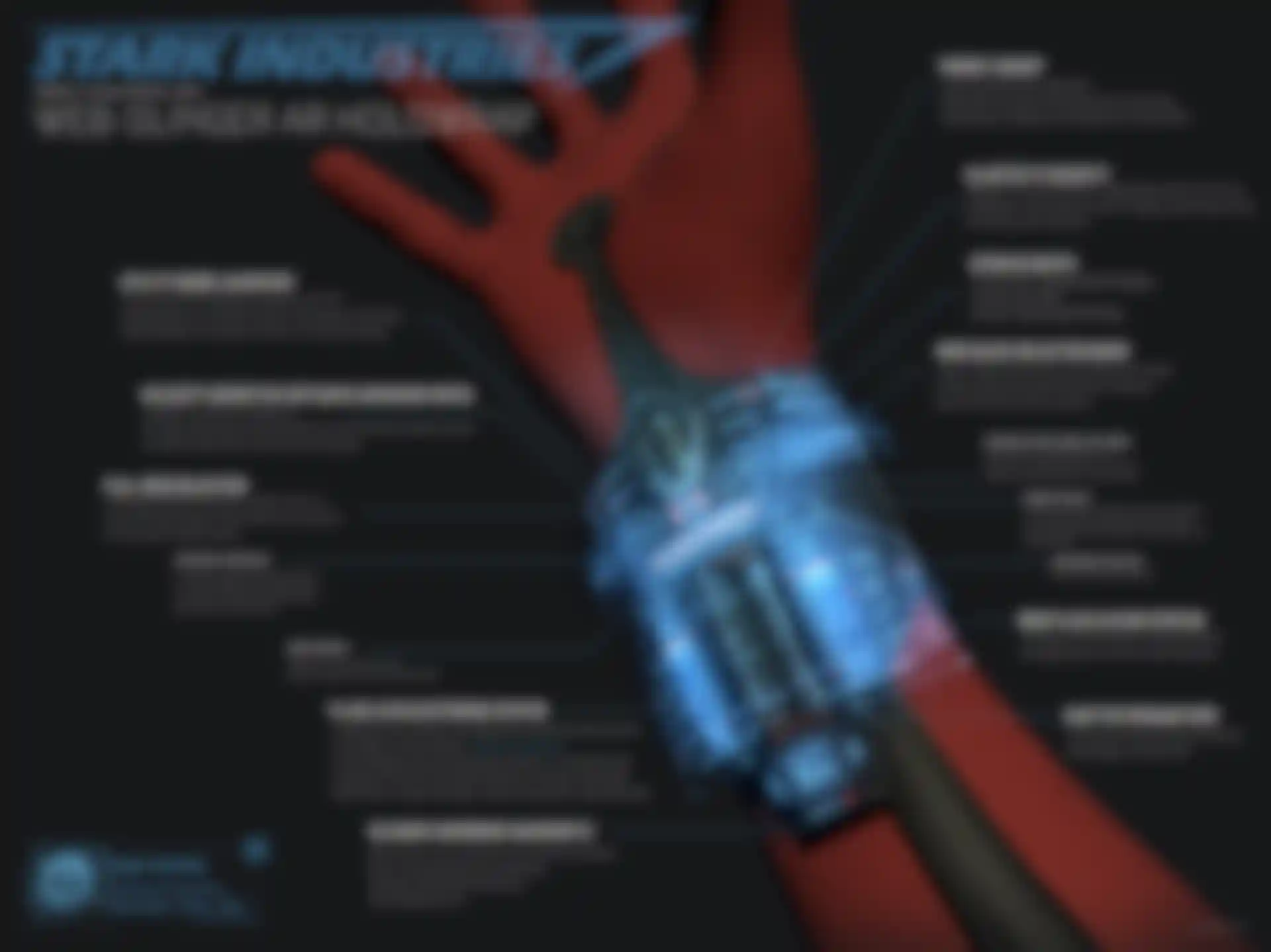
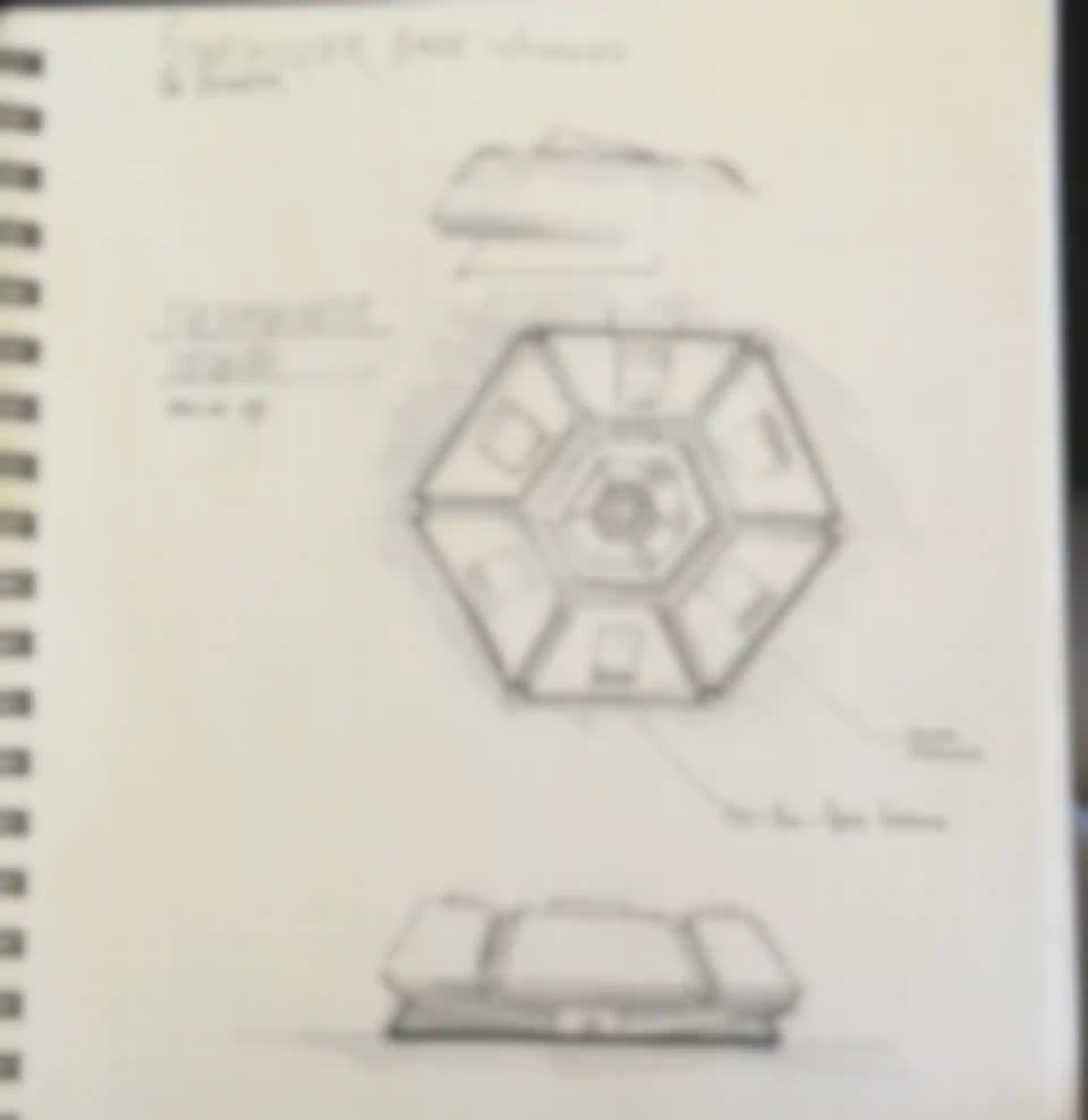
It’s also important to convey that the designs are more than just random lines, colors and blinking numbers. I created a 60-plus-page manual for the two suits that Tony Stark designed in Spiderman: Homecoming. In reality, it’s just kind of a simple leotard. But, because I was also asked to design a series of 12-foot-tall, animated blueprint screens that would be featured behind Tony Stark and Peter Parker at the end of the film, I wanted to know the suits inside and out in order to design something that looked like it came straight from Tony Stark’s lab.
The kinds of documents, anatomies and diagrams I create also help everyone get on the same page quickly, which helps prevent endless revisions. It also helps get initial design concepts approved more quickly because directors know they can trust designers who’ve done their homework.
What do you like most about what you do?
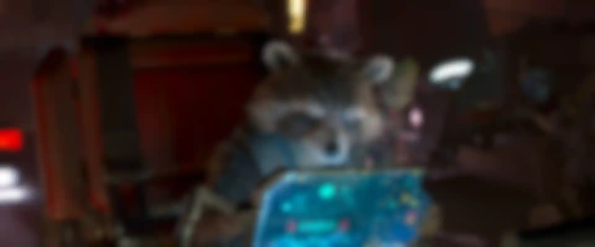
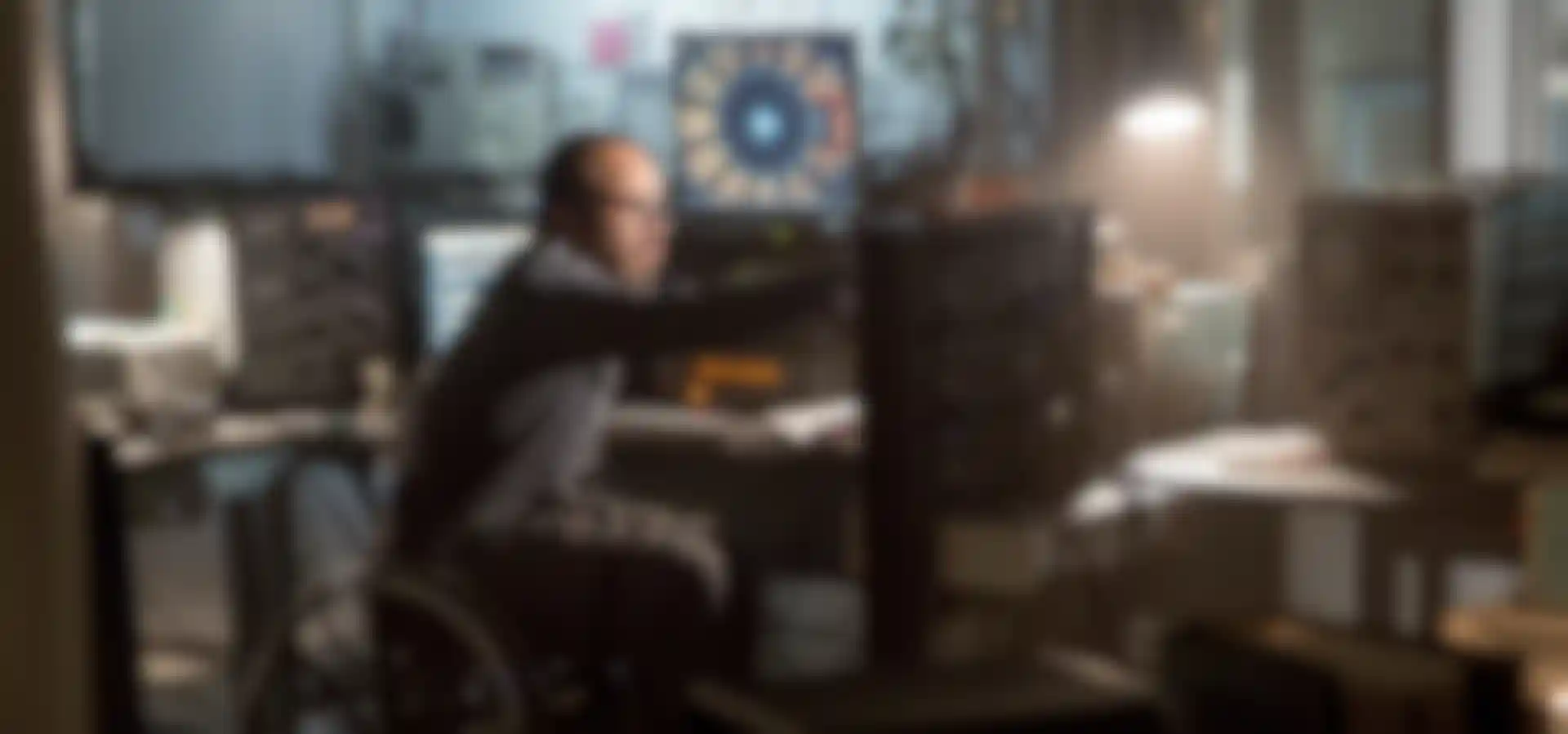
I love that the work is geared towards pushing boundaries, doing the best work ever done and that there is never-ending variety. I get to learn about so many different next- generation, high-tech and cutting-edge technologies. Or, sometimes, even retro technologies, like for The Hunger Games: Mockingjay where the hero character, Beetee (Jeffrey Wright), was sending messages to the districts from Katniss by hacking into the capitol’s communication system using retro, Cold War-era computers.
I took some old-school spectrum hackers to lunch and asked them how they would do it using limited tech. They gave me all of the language and ideas that I needed to make Beetee’s command station look and feel legit. Jeffrey was particularly interested in how his computer setup 'worked' while on set. He wanted to know everything. So I was glad I knew enough details to explain it, and even sound somewhat intelligent when he asked me to sit down with him.
How do you get jobs? Do studios call you directly?
On some films I’m brought on by the production designer, VFX supervisor or the director, and I work directly with them to help future cast and collaborate on the technology design of the film. Other times, I freelance, always with an incredible team, at companies such Cantina Creative, Bad Robot, G-Creative, MPC, Perception and others.
Tell us about landing your dream film.
That would be Star Wars: The Force Awakens. That one was a bit of luck plus perseverance. It was my biggest bucket-list film, and I just had to work on it! The problem was, it seemed to be everyone's else’s bucket list film too, so I was getting nowhere. I asked everyone I knew if they were working on it. Nobody was. I chased it for about a year until I found out the movie was being filmed in the UK. I figured that meant they’d go with UK companies and UK talent. So, I kind of gave up.
Then, one day, I got a call from Andrew Kramer, who said: ‘So, I know you’re the hologram guy, and I’ve got a few questions. I can’t tell you what we’re working on, but you might be able to guess because we have these droids . . . .' I knew exactly what it was and that this was my chance.
So, while nervously walking around my block, I answered all of his questions in the most complete, thorough, helpful way possible. And then, I kinda held my breath and asked: 'Could you use any help?' And he replied, 'Can you be here next Monday?'
A few days later, I sat down next to Andrew at my new office setup at Bad Robot in Santa Monica. My first assignment was glowing on my screen. There were all of the characters I was obsessed with as a kid: Chewbacca, Princess Leia, C3P0, R2D2, Admiral Akbar and Han Solo. They were gathered around, looking intently at a Starkiller Base hologram that wasn't actually there yet. My first assignment was to design the hologram and composite it from scratch. No pressure!
What would you say to artists who would like to do what you do?
We never have enough people who can do this kind of work. If you think it seems interesting, start learning and talking to people that are doing it. One resource I've started is an FUI-design newsletter where I share behind-the-scenes info and other resources for fictional- and future-disruptive UI design.
It’s a challenging field, so it’s not for everyone. But it’s growing very fast because of the avalanche of new films, TV and games that rely on devices and holograms to tell stories. Most designers have designed on flat screens for so long, but now we have cool new questions to explore, like: What do the back and sides of UI look like?
Being able to design 3D holograms with spatial UI’s is also the future of new platforms like augmented (AR) and virtual reality (VR). Everyone from Apple, Google and Facebook, to all branches of space exploration and the military are betting on it taking over as the next computer platform. I would agree one hundred percent. Getting an edge on it now, before everyone else even knows it's a thing, could help you jump into doing some spectacular work, and also help you lead the future of design itself.