Nailed It Singleframe on creating product hero shots for American nail brand Essie.
With a brief to create a CG brand film that celebrated the many colors of Essie, this project ticked all the boxes for Singleframe founder and creative director Matthew Esterhuizen.
An advanced open-water diver in his spare time, Esterhuizen is no stranger to calculated risks. With 20 years of experience, he founded Singleframe as a boutique creative production studio in 2017 while working as VFX supervisor, technical director and 3D artist in London’s competitive VFX industry.
Relying primarily on Cinema 4D and Redshift, the studio spent six weeks creating an elaborate 3D world for Essie that required complex modeling, shading and lighting. For Singleframe, the project illustrates how they have become a go-to creative partner, and we talked with them about how Not to Scale entrusted Esterhuizen to create Essie’s world on the tight deadline.
Please tell us about the brief from Essie, and your approach.
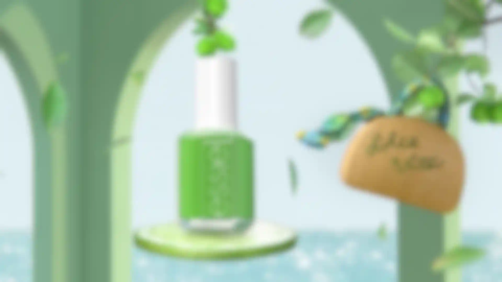
Esterhuizen: We teamed up with director and producer Mirari & Co, and we all worked directly with Essie. The brief was to create a CG animation to showcase a range of eight new nail colors. Mirari developed the concept and style frames for distinct rooms that captured the personality and world of each color.
We were responsible for transforming those style frames into an animated 3D world. Cinema 4D and Redshift contributed to everything you see onscreen from the ground up. Our seven-strong team included a producer, me, 3D artists and motion designers working remotely around the world, and the result proves how much can be achieved with that approach.
What were the main challenges you faced?
Esterhuizen: There were definitely some interesting challenges. The job was complex in that our client had approved style frames created in 3ds Max using Octane mixed with Photoshopped reference photos. We had to recreate Mirari’s concept in 3D, matching the frames exactly in terms of lighting and shading throughout each animated scene.
On top of that, we had to create separate lighting rigs just for the bottles to make sure they always looked exactly like the brand photos, as well as keeping them sharp while everything else had motion blur.
We recreated each style frame from scratch in Cinema 4D and Redshift. And, simultaneously, we made a low-res, greyscale animatic showing the transitions and pace of the edit. For reference, the client gave us temporary lines of dialog and estimates of how long each room should play.
Every artist got involved making the baseline renders, and we updated each shot in Premiere Pro and presented them to the client daily to show how the edit was progressing. We tweaked the animatic as the dialog was finalized and the timing became clearer.
Once we had client approval for a scene, we used Cinema 4D to model, light, animate, simulate, texture and render. Redshift was used with its multiple AOVs alongside Cinema 4D Takes, giving us more control in comp. We comped everything in After Effects and used Redshift to render all the in-camera depth of field. Finally, Rebus and Pixelplow cloud rendering supported the workflow for our remote team of artists.
Which elements were most challenging and how did you achieve the look?
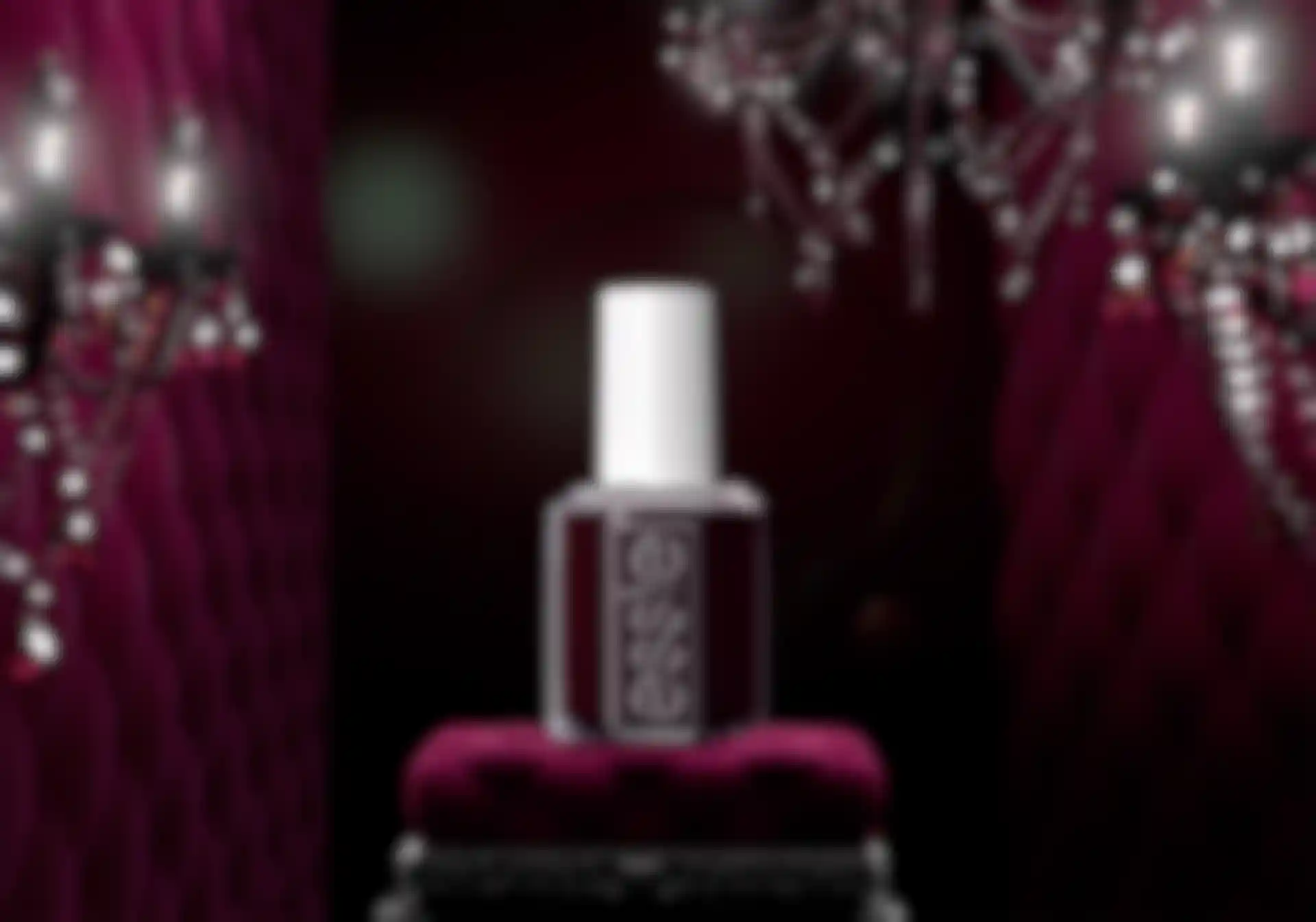
Esterhuizen: The biggest challenge was getting Essie’s bottle to look exactly like the brand reference photo instead of the physical object. To do that there were some issues we had to resolve.
We didn't have time to 3D scan a real bottle, so we modeled it the old-fashioned way using side pictures of the product to match it by eye. The next challenge was that the bottles had to always be shown at a specific angle, so we had to counter animate them as our cameras moved around.
How the liquid refracted was another issue for us. If you look at the product in the shops, you see the thickness of the glass around the edge of the bottle. That’s Photoshopped out in the brand photos, though. So to match the reference, we had glass refracting and, at the same time, the liquid went to the edge, requiring multiple passes to achieve.
The Essie logo also needed to appear with the same reflections as in the brand photos, and that couldn't change no matter where the bottle was in a scene. To do that, we created the logo as a displacement map. Next, we made another light rig and a bevel pass for the word highlights that were applied over the final render of the bottle.
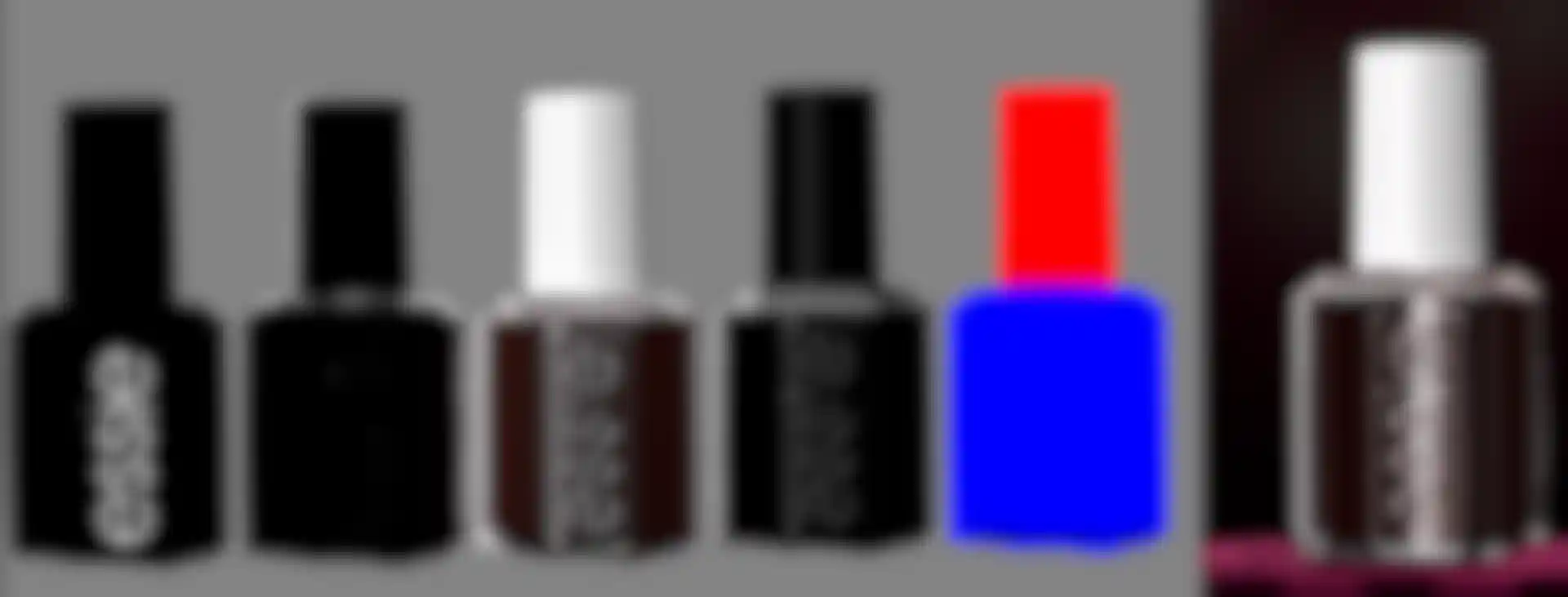
It was a balancing act to make the colors look like they do in real life, as well as the brand photos. To get that right, we used physical samples and high-res branded imagery of the nail polish as reference and created several shaders. When we eventually nailed the reference, we got a lot of satisfaction seeing it turning in 3D in each shot, always looking like the brand photo from every angle.
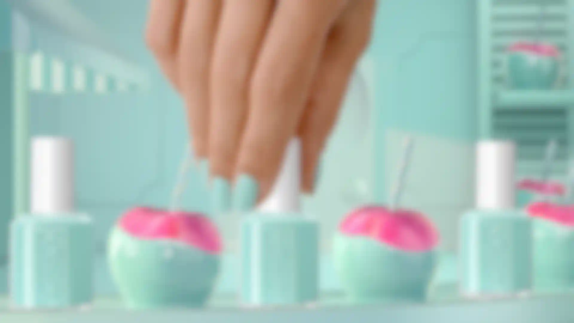
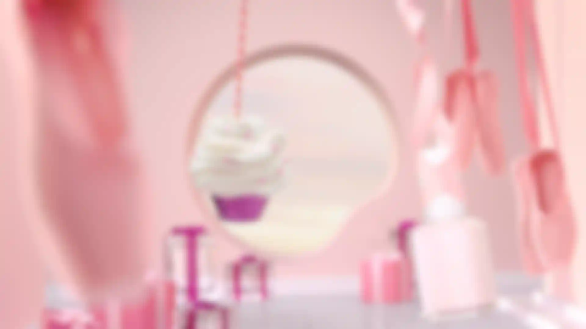
Tell us about the cupcake scene.
Esterhuizen: The client wanted us to match a cupcake swirl for swirl from the style frame reference. All we had was a low-res photo, so we created that by eye using Cinema 4D Sculpt.
Next, we used Redshift simplified subsurface scattering to create the soft-serve look along with its own lighting rig, which had lights of different intensities to emphasize the different thicknesses of the swirls. It was super simple but effective. As for the purple sprinkles, we used the base Redshift material SSS with a high reflection value, and it was affected by the same lights as the icing.
What was most rewarding about this project?
Esterhuizen: This was a cool project because we got to play with elements, push the shaders of so many different materials and make something colorful and dynamic with many overlapping and moving parts. We live for those kinds of challenges.