Using 3D to Help Make Coronavirus Understandable Medical illustrators explain how they’re using art and science to help visualize an unprecedented global threat.
Medical illustrators spend their days translating the latest research into visuals for viewers ranging from lay people and teachers to medical professionals, pharmaceutical makers and scientists. The images they create make difficult-to-fathom biological processes more tangible. And in the case of the coronavirus (SARS-CoV-2), which is about 1,000 times smaller than the width of a human hair, medical illustrators all over the world have taken up the challenge of showing how the virus looks and affects the human body.
While their work routinely requires poring over research papers and analyzing data, medical illustrators also rely on a fair amount of artistic license to visualize such complex things. Nicholas Woolridge, an associate professor at the University of Toronto Mississauga, recently used Cinema 4D to create 3D animations and stills of the SARS-CoV-2 virus, which causes COVID-19. Both are free to use under a Creative Commons Attribution-NoDerivatives 4.0 International License.
Woolridge, the former longtime director of the Master of Science in Biomedical Communications program at the University of Toronto’s Institute of Medical Science, studies the development of visual media for biomedical research, teaching and patient assistance. The University of Toronto Mississauga is home to the only program in Canada for medical illustration and, in the fall, he will be teaching graduate courses in organic modeling and cinematic design.
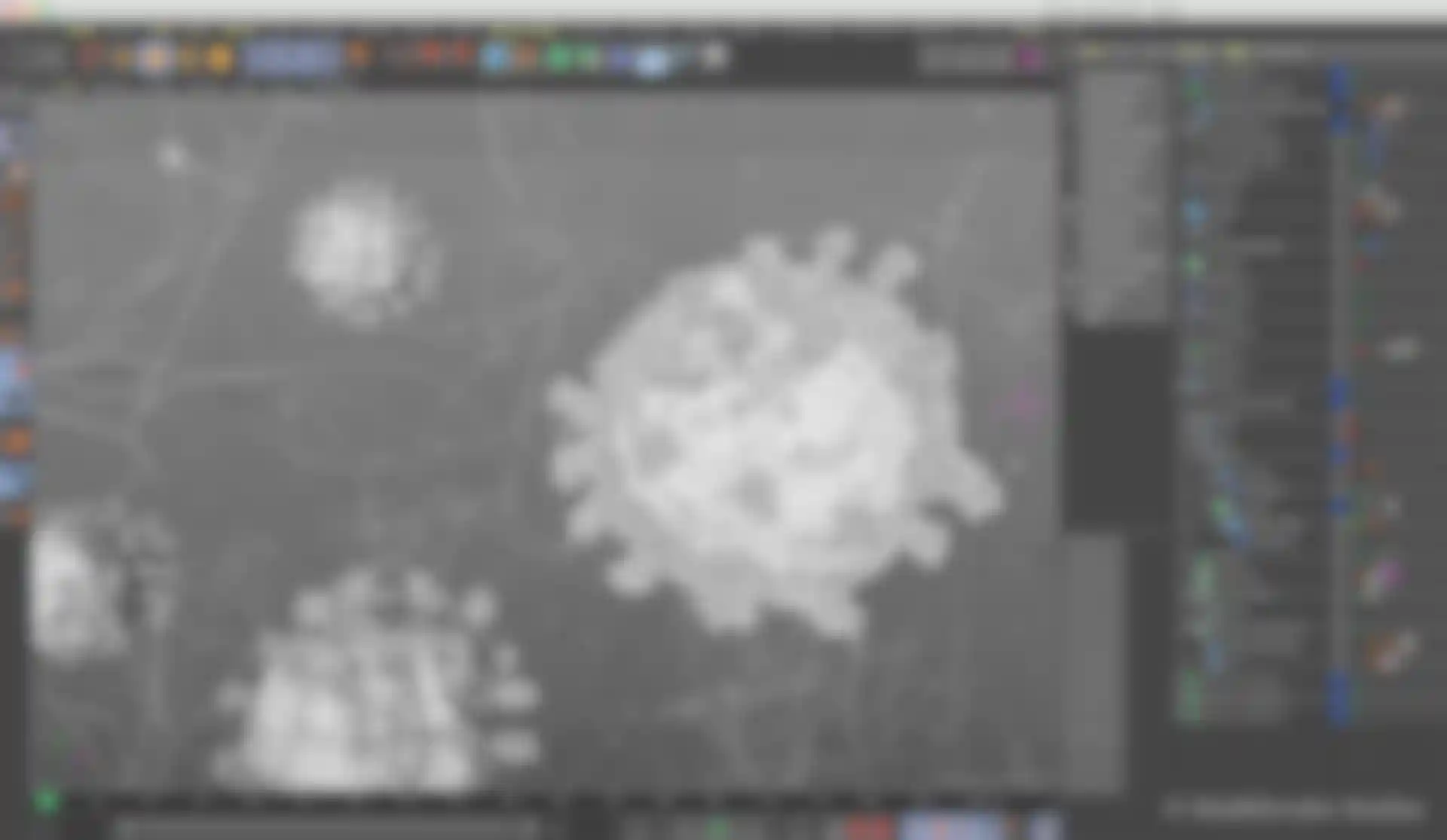
Currently on a research leave, he’s been challenging himself with 3D visualization projects and became very concerned and curious about the virus. “I was happy to see that within a month of it becoming commonly known, scientists had figured out some of the major molecules that make up the virus’ structure,” he recalls. Wanting to create something that showed more complexity, he used actual protein structural data for SARS-CoV and SARS-CoV-2 to make visualizations that were both interesting and attractive.
“The overall arrangement of the proteins was all based on papers, but details about the packing of the interior of the virus is still hazy, so I made the best guesses I could using what is known,” he explains. Like other medical illustrators who use C4D, Maya and other 3D software, Woolridge used the ePMV plugin to import assets from the RCSB Protein Data Bank directly into Cinema 4D. “This is a membrane-bound virus, so I isolated lipids from a lipid bilayer and brought them into Cinema 4D as little, individual elements and used MoGraph tools to replicate tens of thousands of them to create the membrane model,” he continues.
Woolridge could have just considered his work a personal project, but he really wanted to make the animations and illustrations public and free for anyone to use. So he talked with other faculty and found that many students in the program, as well as alumni, wanted to create virus-related work too. Today, their collection of visual resources for science and health professionals is available on the Biomedical Communications program’s media resource page.
“It’s been really interesting and heartwarming to see the illustration community step up in this unprecedented moment,” he says. “Our role is always to translate what would otherwise be very difficult to understand, even for scientists who use medical illustrations as thinking tools. There’s so much we don’t know and if visualizations can help people ask new questions or change behaviors, we’re making a small contribution.”
Pushing Medical Animations to a Cinematic Level
Award-winning medical animation studio MadMicrobe primarily works with health care marketing agencies and pharmaceutical companies on animations showing how diseases progress or how particular drugs work within the body. But when the coronavirus presented a unique opportunity to visualize an unusual and infectious disease, they dove into the task of thinking about how to do that artfully. “The same visuals were being shown on the TV and online over and over, so we wanted to push things into a more cinematic realm, like we try to do with all of our work,” says Joel Dubin, MadMicrobe’s co-founder and creative director.
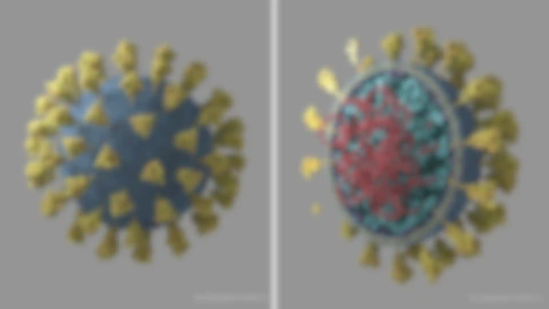
In consultation with the studio’s science director, Veronica Falconieri Hays, who is also a certified medical illustrator, Dubin and Andy Lefton, MadMicrobe’s lead 3D artist, used Cinema 4D to create two different visualizations of what the coronavirus looks like. Dubin opted to focus on accurate representations of the proteins that make up the virus and its internal structure of RNA, using data from the RCSB Protein Data Bank, as well as resources posted on a constantly updated Google doc for medical illustrators working on SARS-CoV-2 projects. “Even using all of that data, there is still a level of stylization because, as artists, we straddle the line between accuracy and artistic interpretation of the information we’re working with,” Dubin says.
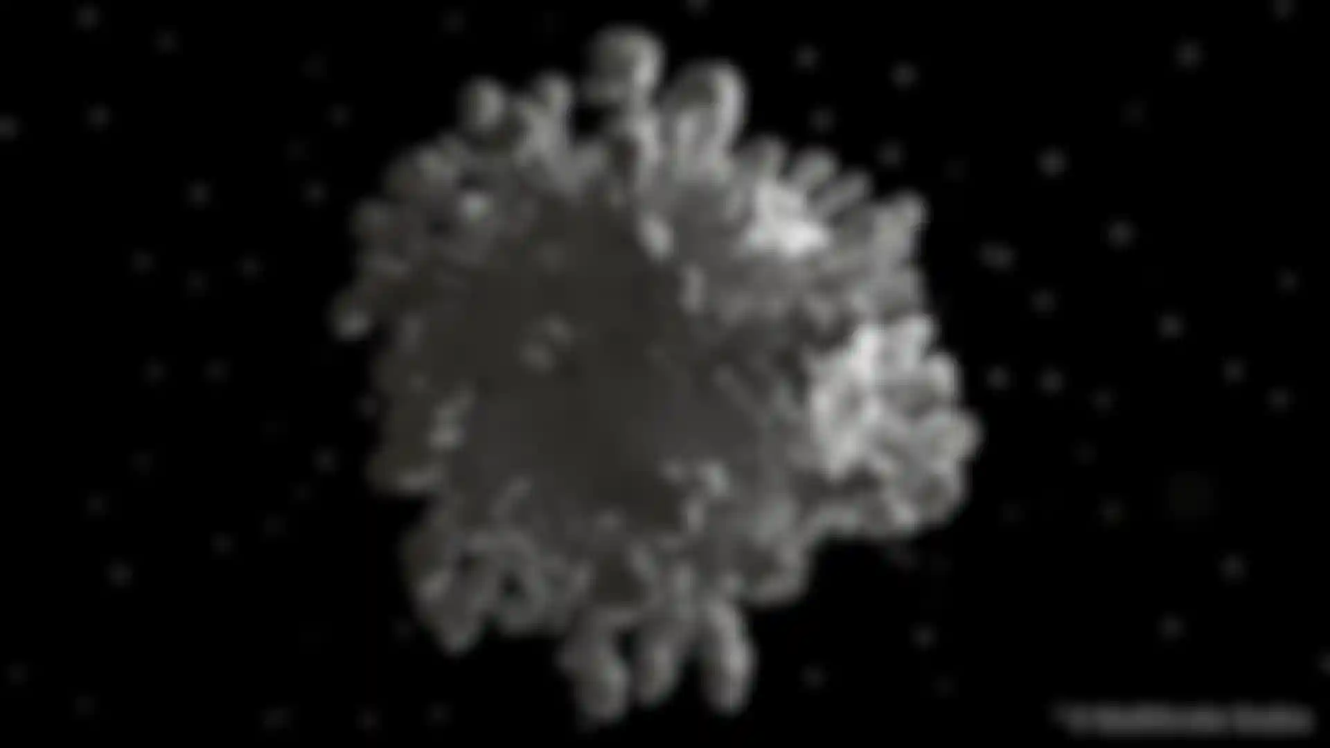
It was Falconieri Hays who showed him, and Lefton, microscopy images of the virus, revealing that it is not really round and smooth as it is often depicted in the media. “The shape of the virus is very organic and irregular, so I tried to capture that and get the size of the spike proteins to be at least somewhat accurate because they’re not evenly spaced either,” Dubin says. After starting off with a sphere in C4D, he imported the spike proteins from the protein database using ePMV and cloned them onto the virus’ surface with random effectors. “To get the look of the surface I wanted, I used a nice feature in Arnold that allowed me to use a MoGraph matrix object to place a vertex point onto each polygon of the model and then generate phospholipid spheres at render time. The spheres were offset in scale, position and coloration for an additional touch of irregularity”.
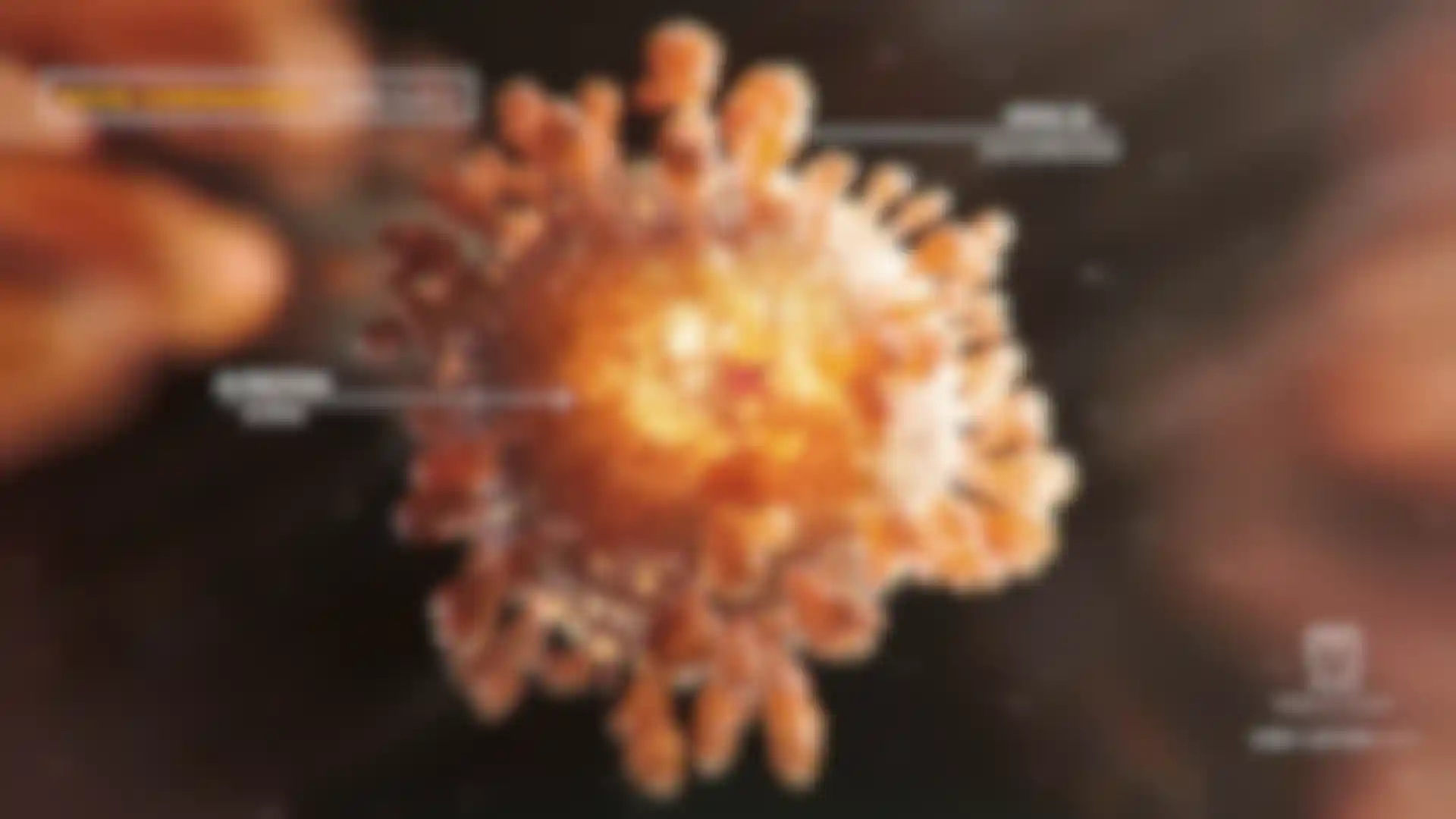
Lefton took a more stylized approach to his coronavirus illustration, starting with a sphere in Cinema 4D and using X-Particle trails to grow off of it before using a spline mesher to bring the two together. “A lot of the detail came from Redshift’s Hair, which I used to break up the surface and give it a membrane feel,” he explains. Rendered in Redshift and color graded in After Effects and Photoshop, Lefton describes his visualization as a “labor of love” and a different interpretation of the virus.
“Stylistically, the virus feels chaotic and I wanted to portray that,” he says, adding that he intentionally visualized the virus in a way that captures its ominous feeling and menacing presence while keeping a cinematic feel. “Working with Veronica helped me immensely with the science of the virus and understanding the role and proportions of each element involved,” he continues.
Visualizing the Coronavirus
While she often acts as a science consultant for other medical illustrators, Falconieri Hays is also the principal of Falconieri Visuals, a scientific and medical illustration and animation studio in Maryland. She uses Cinema 4D to visualize microscopic and nanoscale stories for clients in research, biotech and pharma. Her skillset is particularly unique because, after earning her degree in medical illustration, she spent time working in a research lab where they studied 3D shapes of molecules. “I gained a deeper scientific knowledge there that really helps me fill in gaps when I’m trying to visualize something in my own work or helping others,” she explains.
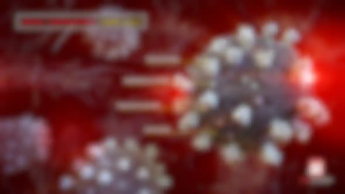
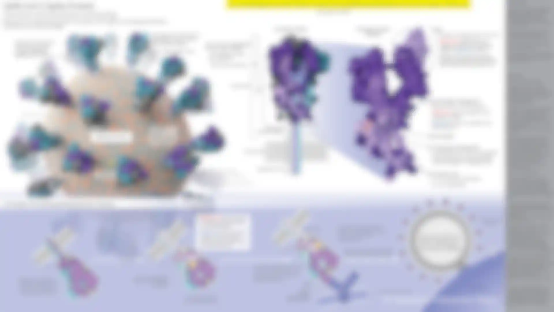
Recently, she has been working with colleagues in the Association of Medical Illustrators to research and visualize aspects of the coronavirus (SARS-CoV-2) for health professionals and the public. In March, she finished work on her own illustration of the spike proteins on the outside of the virus to help make clear how the virus attaches and infects. The spike, she explains, has a few differences between this virus and other SARS-related viruses, which may help explain its spread.
Since sharing her illustration on Twitter, she has received a lot of positive feedback from colleagues and scientists, including a few personal messages. “There were even a few scientists who messaged me to let me know it was helpful, which was very satisfying,” she says.