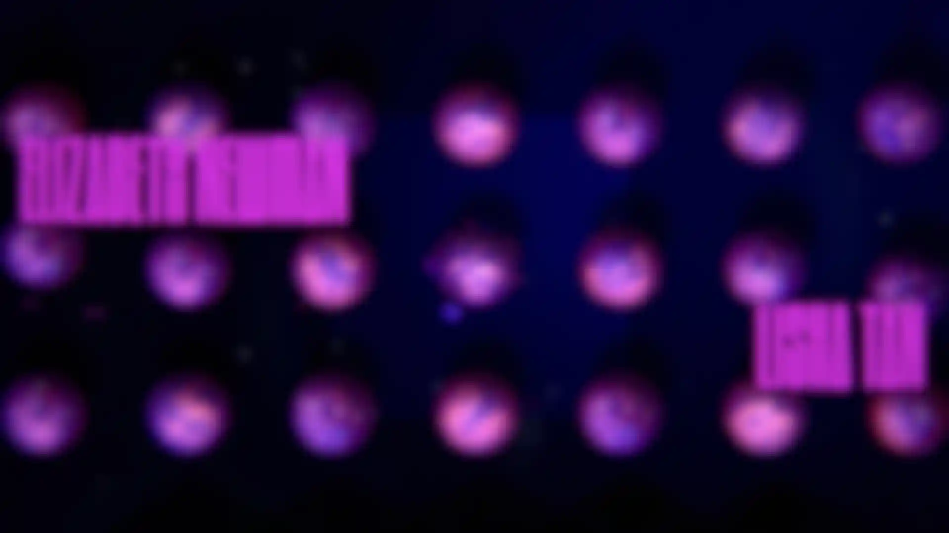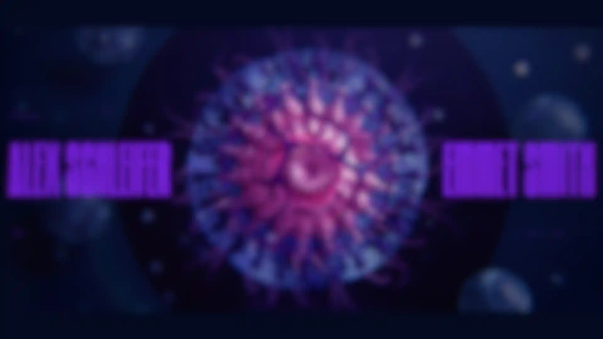
Creating the Semi Permanent 2018 Titles Joyce N. Ho and Nidia Dias offer a behind-the-scenes look at a global collaboration.
For 16 years, Semi Permanent has been bringing together artists from all over the globe for a three-day design conference devoted to sharing experiences and ideas. The event’s title sequence is a key part of the action. Hong Kong-born, New York-based designer Joyce N. Ho directed the 2018 titles, the theme being “creative tension as inspiration.” The first female director in the conference’s history, Ho assembled a team of 11 collaborators who worked remotely from around the globe, including designer and art director and Nidia Dias, who used Maxon’s Cinema 4D, Red Shift, After Effects and X-Particles for Act III.
We asked Ho and Dias to break down the widely praised, otherworldly titles, which were made in partnership with Dropbox, including explaining how the titles were inspired by the work of Ernst Haeckel, a German professor and biologist known for discovering and naming thousands of new species while also helping to visually promote Charles Darwin’s theories of evolution.
Joyce, how did you get the job of creating the 2018 titles?
J.N.H.: I actually reached out to the founder of Semi Permanent, Murray Bell. Since going freelance and moving to New York from Australia, where I grew up, I’ve made it a personal goal to try to direct something every year. Last year, I did titles for Likeminds, and Semi Permanent has always been a part of my design life. Every year they do such amazing title sequences by a lot of designers I really look up to, so I thought, ‘Wouldn’t it be cool if I could direct the titles?’ So I sent Murray an email last year, explaining who I am and that I’d love to do the titles. I didn’t expect to hear anything back but he got back to me a few weeks later to say that Framestore was doing them for 2017 and he would like me to do them next year. I was just over the moon.
Talk a bit about your background, and how you became a motion designer.
J.N.H.: I was born in Hong Kong and my family moved to Brisbane, Australia, when I was 4. I’ve always loved watching TV, and I think that’s how I got introduced to animation, just watching a bunch of cartoons and also drawing and making things. After high school, I went to the Queensland University of Technology and majored in animation. Once I discovered motion design, though, I realized that was for me.
Nidia, how about you?
N.D.: I’m a designer and art director. I grew up in Portugal but I’m living in Toronto right now. I’ve always liked to draw but I went to engineering school for one year before realizing it was completely not what I wanted. So I studied graphic design for three years and then discovered motion design. I moved to Canada in 2017 to work at Tendril.
Joyce, what kind of direction did you get from Murray Bell?
J.N.H.: The titles needed to speak to the idea of creative tension, and Murray explained what that theme meant to him. After the initial call, I broke down his explanation, always thinking about how to tell the story while allowing enough room for other people’s ideas. We only had three months, so it was a big puzzle to solve. Murray also wanted the 2018 titles to be a little bit different. Semi Permanent had a bigger partnership with Dropbox, so they asked me to organize a grand collaboration between artists who work in 3D, design, motion graphics and music. I would be the director and we would use Dropbox to work together remotely. I had free reign to choose my team, which is such a rarity and a wonderful opportunity to work with designers I really admired.
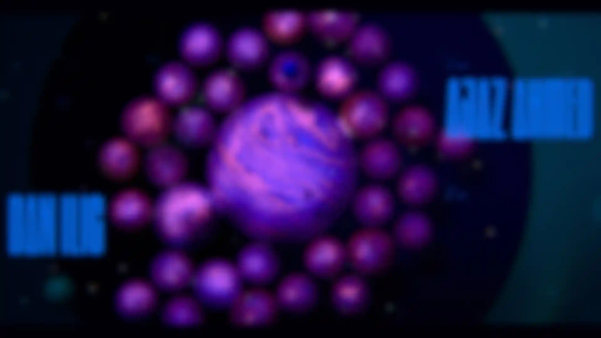
I knew I wanted to center the direction around nature and science because they’re such a huge inspiration to me. While doing research the old-fashioned way at the New York Public Library, I found Artforms in Nature by Ernst Haeckel. He did beautiful illustrations of micro-organisms and algae and creatures from the sea. I was so inspired, and I knew right away that those would be my key references. I wrote a treatment with three acts: Pushing and Pulling, Friction and Release. I thought about how I wanted to visualize each section and then broke down each act into style frames.
I gave those style frames and a base music track I was working with to the collaborators I reached out to. Lucky for me, about 90 percent of the people I asked to participate said yes. They had the latitude to interpret what I gave them, and I was super open to them bringing in their own sense of style, as long as it kept with the color palette and what my idea of what the shot needed to be.
Describe what happens in the titles?
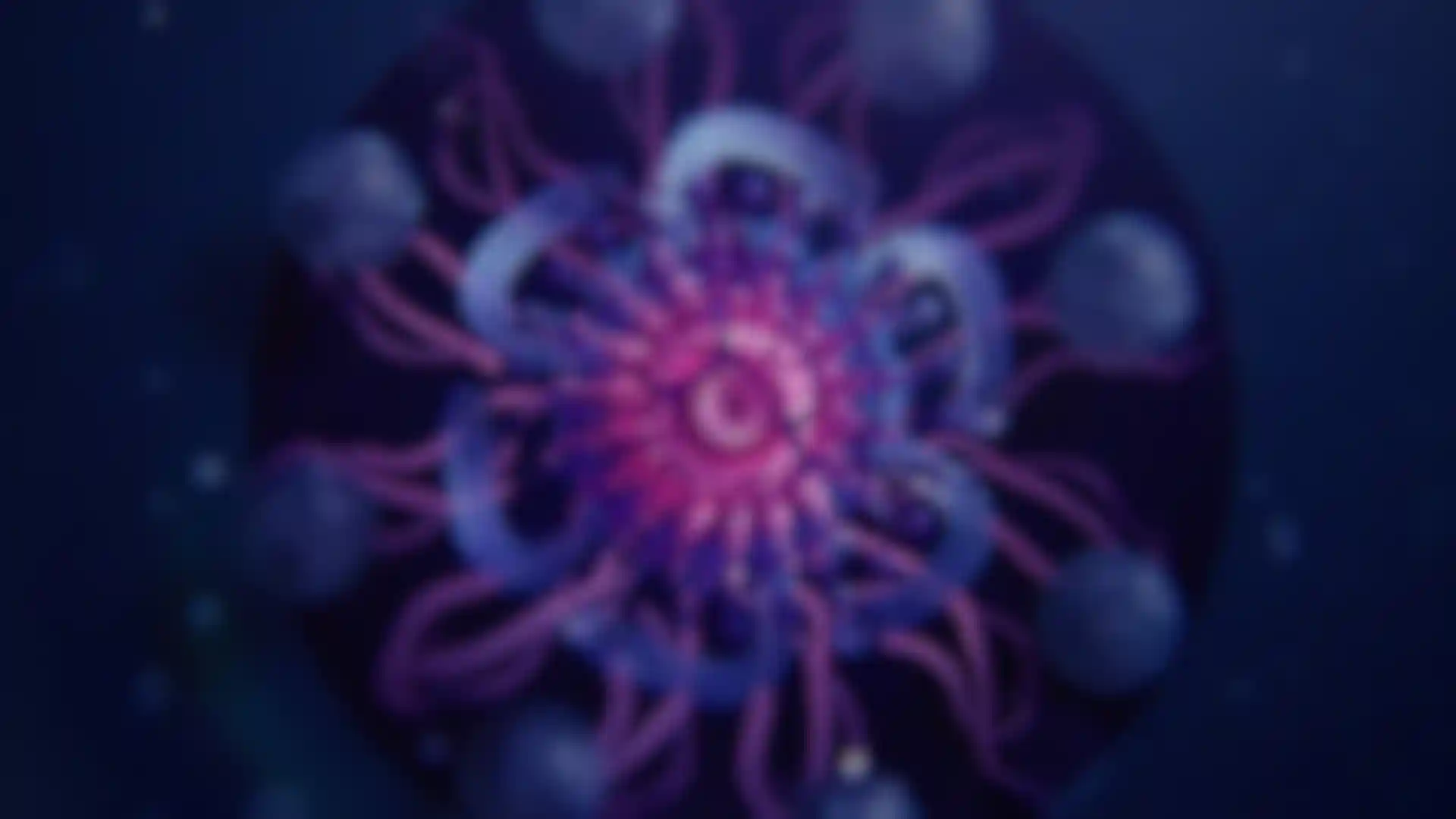
J.N.H.: It’s a microscopic world inspired by Haeckel. You follow the organisms from birth to death and the three acts are really stages of creative tension. The beginning is all about the time when creative concepts are forming. We shot in 4K, so we were able to zoom in and follow the sphere, which was half a Styrofoam ball. I composited a digital sphere later. Act II represents aspects of a project that can cause conflicts, like deadlines and budgets. There’s friction in the process at this point, and I showed that using the principle of cell division. This act represents multiple aspects of a project that may be causing conflict; whether it be the timeline or the budget or the actual project itself, it's where things are evolving and sometimes not working out the way you want it to — that little bit of friction in the creative process. And yes, I felt like I was living out all these stages through the creation of the titles in real life! Nidia created the first half of Act III, which represents the micro-organism, or idea, in its most complex form. At this point, I wanted the organism to have tentacles, which turned out to be challenging. She definitely had one of the toughest 3D shots.
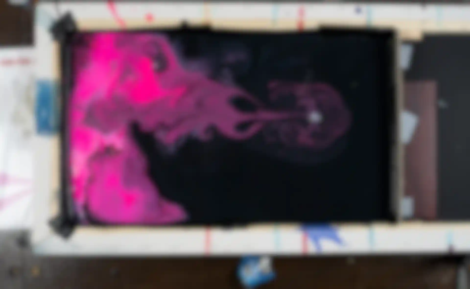
Nidia, explain what you created to visualize “Release” for Act III.
N.D.: Joyce knew what she wanted from the start, which was great, and the music was done so it was easy to put things to the beat. My job was to make something that looked like a living organism. Joyce gave me a bunch of Ernst Haeckel references, and I combined a lot of what I saw into one fake 3D organism, which I wanted to look a bit like a jellyfish. I started by doing an animatic and motion tests to get the movement right before I modeled something. I used MoGraph, the bevel deformer, and a few other deformers to make the organism look like it was alive, but my main challenge was getting the motion right. (Watch Dias’ breakdown video below.)
J.N.H.: The difficult thing with the tentacles was that they looked great from the side, but when we placed the camera above them, they didn’t have the depth we wanted. I animated them in 2D using a rigged Newton joint [a 2D physics simulator], and then Nidia comped those into the 3D shot in Cinema 4D.
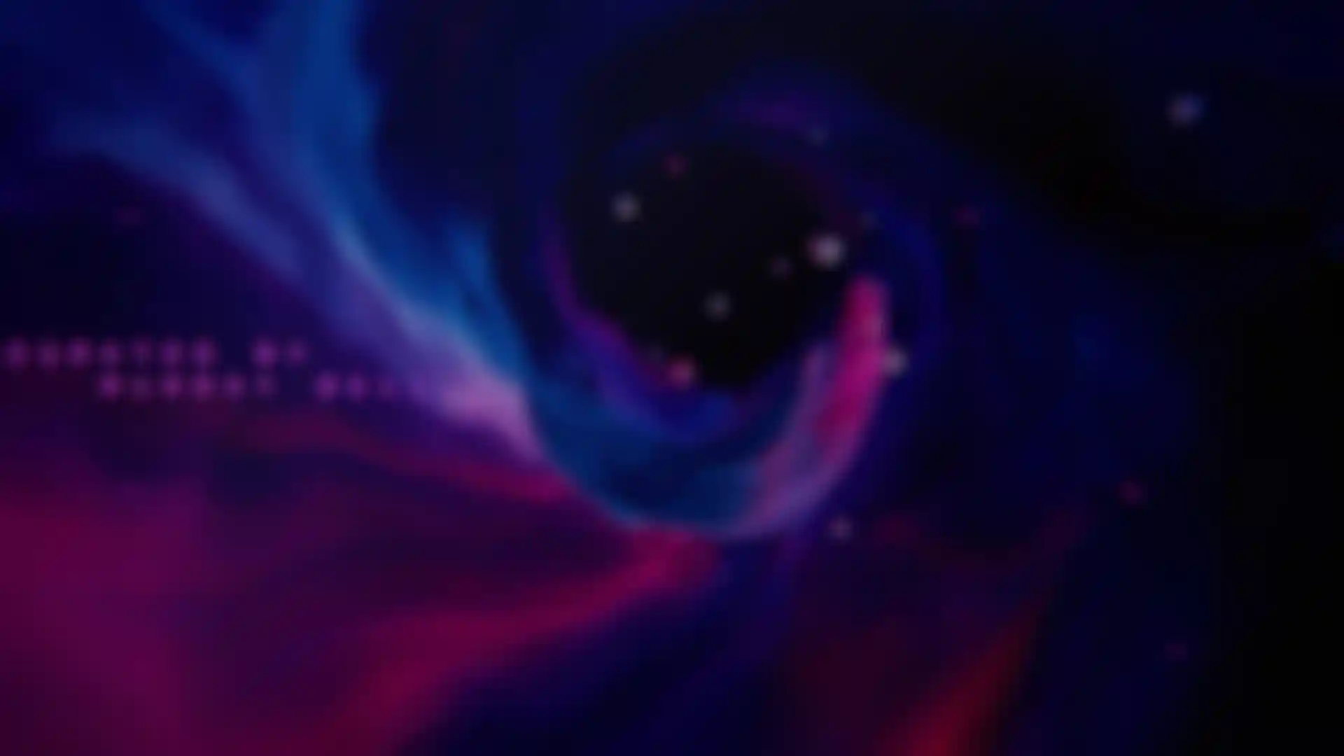
N.D.: I also collaborated with Joyce on the tunnel shot where everything feels like it is being pulled into a vortex. I used X-Particles for a few variations of the tunnel, which was emitting little circles from my previous shot. I layered my C4D file in After Effects so that Joyce could use to make the tunnel look so painterly. I had a great time working on this project. Joyce’s art direction was beautiful, and I loved the color palette and that everybody was able to bring in their own style.
How do you see your career evolving?
J.N.H.: Currently, as a freelancer, I do a wide range of stuff. I specialize in art direction for motion, and I really like to direct my own projects. Title design is something I’m very interested in and what to keep doing. I enjoyed the puzzle aspect of this project so much. Completing such a mammoth project and being able to work with so many designers whom I’ve really admired from afar was so amazing. It was a rare opportunity and very much a dream project that means a lot to me personally and as a designer.
Credits:
Direction and Production: Joyce N. Ho
Music & Sound Design: Ambrose Yu
Type Design & Animation: Worship Audio
Design & Animation: William Arnold. Nidia Dias, Joyce N. Ho, Somei Sun, Joel Watkins
Cinematography: Davy Evans
Edit: Alex Gee
Storyboard: Mercy Lomelin
Additional Animation: Hayato Yamane
Special Thanks: Murray Bell, Patrick Clair, Jonathan Kim, Dropbox